

A New Look for Abiwin
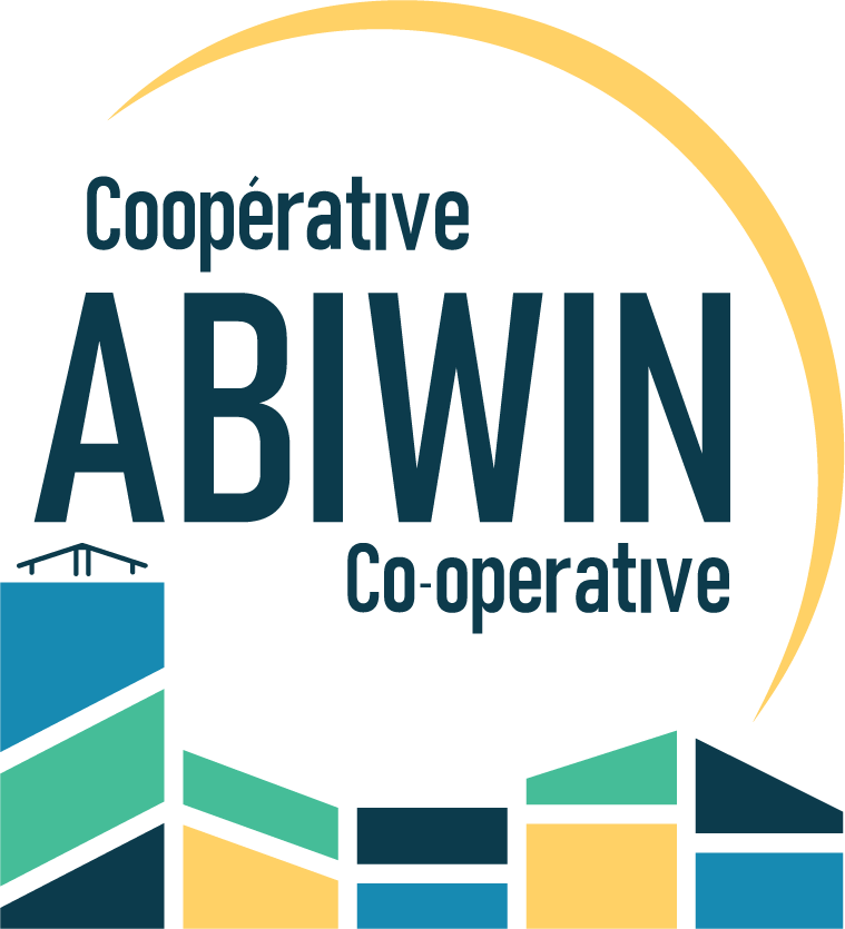
The logo reflects Abiwin's identity as a structured, member-run housing co-operative rooted in community.
The architectural forms, inspired by the Somerset Street properties' profile, represent the diversity of our homes and membership. Their interlocking arrangement symbolizes cooperation and shared responsibility.
The arc above suggests continuity, stability, and collective support. It is a subtle gesture toward the protective and inclusive spirit on which Abiwin was founded.
The colour palette reflects warmth, diversity, and our urban setting.
Our Simplified Logo
A simplified version of our logo ensures clarity and recognition at smaller sizes and in limited spaces.
Our Colour Palette
Four complementary colours bring together stability, warmth, diversity, and community.
Our Identity, Our Voices
A co-operative identity is more than a logo. It is shaped by the people who call Abiwin home.
Members will have the opportunity to suggest a tagline — a short phrase that reflects Abiwin's values, spirit, and aspirations. Details on how to participate will be shared with members.